Raphaella Peters
Work
About
Resume
Contact
CityGreens
The CityGreens Farm Management Suite (FMS) boosts farm productivity, an app catering to hobbyist gardeners and large-scale farm managers, offering a centralised hub to manage their plants being cultivated through hydroponics. Connected to the kit’s IoT devices, its elegant frontend simplifies complex tasks.
Results
Faster farm setups and lesser drop-offs
*I worked on this project while working as a designer at KuboDesign
roles
User Research, UX Design, UI Design, Visual Design
tools
Figma, FigJam, LucidChart
duration
16 weeks
background
Owners, agronomists and labourers have a hard time communicating with each other on day-to-day responsibilities
Being in the agritech industry, City Greens faced major problems with their farm management software since a majority of their users were labourers who weren’t too familiar with using digital products. They were looking for an end-to-end redesign of their product to accommodate the labourers and showcase the most optimal method for achieving year-round yield.
I designed the retail facing app (catering to mostly hobbyists) along with an Operational Dashboard PWA specifically for large farm owners with added functionality in order to better oversee operations.
problem statement
How can we help simplify the farm set up, and allow for seamless communication & task setting?
The set up process is tedious and results in drop-offs. Agronomists, farm owners and laboureres need an easier way of communicating, as well as streamlining the processes of a regular work day for the employees of the farm.
user research
Users have a hard time communicating with each other and keeping up with tasks
Points of understanding:
What users experience while trying to set up farms
What users experience while trying to communicate with each other
Research revealed that users had an incredibly hard time setting up their farms. Several users complained the process took too long and required too much information. The process was overwhelming for someone who wasn't familiar with such software tools.
There was a lot of confusion between crop plans, users were not able to tell where their tasks were getting created. To solve this problem, we broke down what information was absolutely necessary for a farm setup within the initial setup and what data could be collected later.
Data visualisations were added to support crop plan creations to allow agronomists and labourers to understand the progression of the plants within sections over time. Numeric Indicators were added to inform the user about exactly how many plants could go into a section with constraints such as seasons and allowed sections.
Key Insights
The set up process is tedious and results in drop-offs. Agronomists, farm owners and laboureres need an easier way of communicating, as well as streamlining the processes of a regular work day for the employees of the farm.

Simplified communication
Agronomists, farm owners and labourers find that updating relevant information on the application was easier than trying to get a hold of each other

Seamless task/issue updating
All use cases find that it’s convenient for them to either upload tasks or issues to be uploaded or marked as complete, and keep track of everything.

Easy device set-up
Farm owners find that the set-up process is easier now that it’s isolated to one device

Small & large scale
Both hobbyists and serious farmers find that they’re able to benefit from the streamlined task and user flows.
user persona
Target users are farm owners, agronomists and labourers that need to communicate with each other through the work day
Tigger
Pain points
crop management
labour management
data overload
Goals
crop optimisation
labour management
data insights

farm owner
Mark
Pain points
remote monitoring
data collection
knowledge sharing
Goals
effective monitoring
data integration
knowledge exchange

agronomist
Frank
Pain points
task clarity
communication
training
Goals
clear instructions
improved communication
training support
labourer
feature ideation
Features for app
I ideated on possible product features that were accessible and intuitive

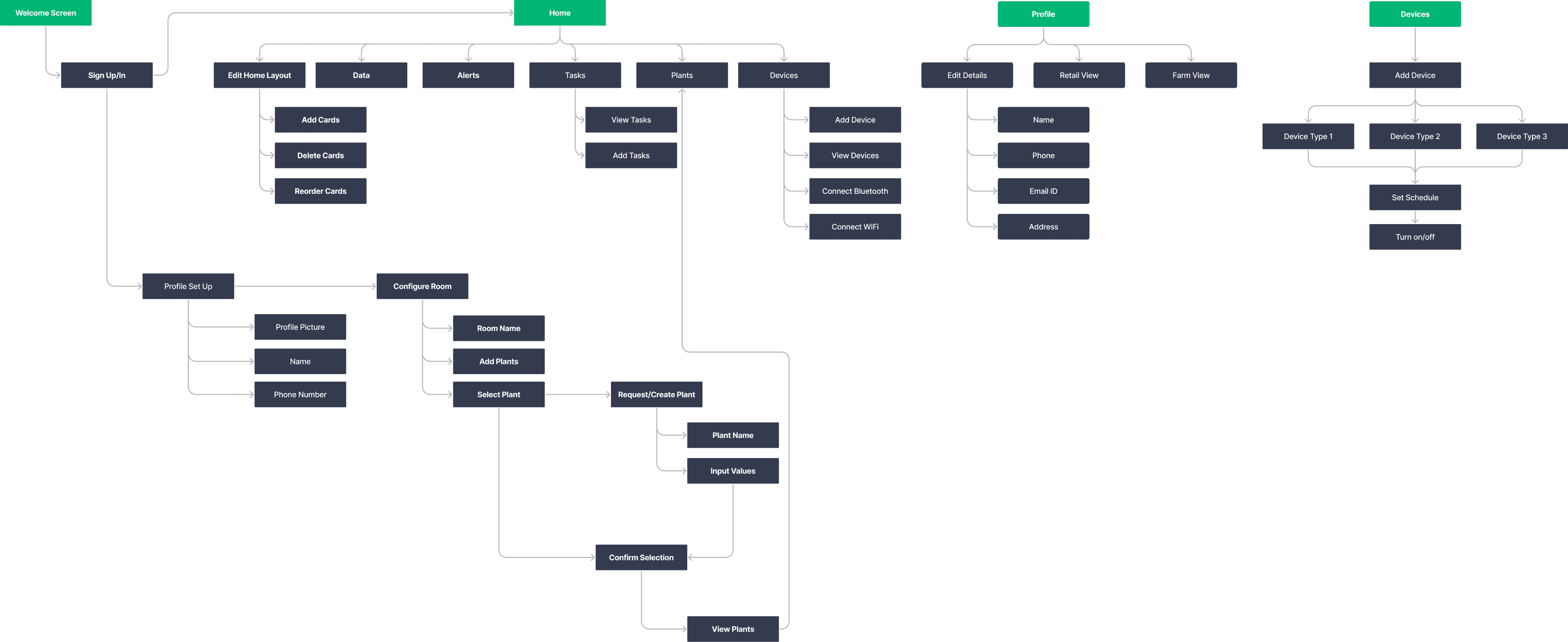
defining the structure
Information architecture
visual design
Brand & visual guidelines
The client wanted to use their existing branding, supplemented by informed design choices. Drawing from existing colour schemes, I created the colour palette.

Colour palette
A dark theme was chosen as the client wanted me to implement the glass morphism style in the designs.
Background
#121212
On Background 1
#FFFFFF
On Background 2
#8A8A8A
Surface
#FFFFFF
On Surface
#8A8A8A
#FFFFFF
On Error/Success
On Primary
#FFFFFF
Inactive/Disabled
#3D3D3D
Inactive/Disabled
Text
#848A86
Inactive/Disabled
Text Alternative
#8A8A8A
Error
#D13604
Success
#308000
Primary
#00B674
Primary
Variant
#00B674
#72AAFF
Primary Accent
Typography
The font ‘SF Pro’ was used throughout the app.
H1
The quick brown fox jumps over the lazy dog
H2
The quick brown fox jumps over the lazy dog
H2
The quick brown fox jumps over the lazy dog
Body1
The quick brown fox jumps over the lazy dog
Body2
The quick brown fox jumps over the lazy dog
T&C/Hyperlinks (regular)
The quick brown fox jumps over the lazy dog
T&C/Hyperlinks (bold)
The quick brown fox jumps over the lazy dog
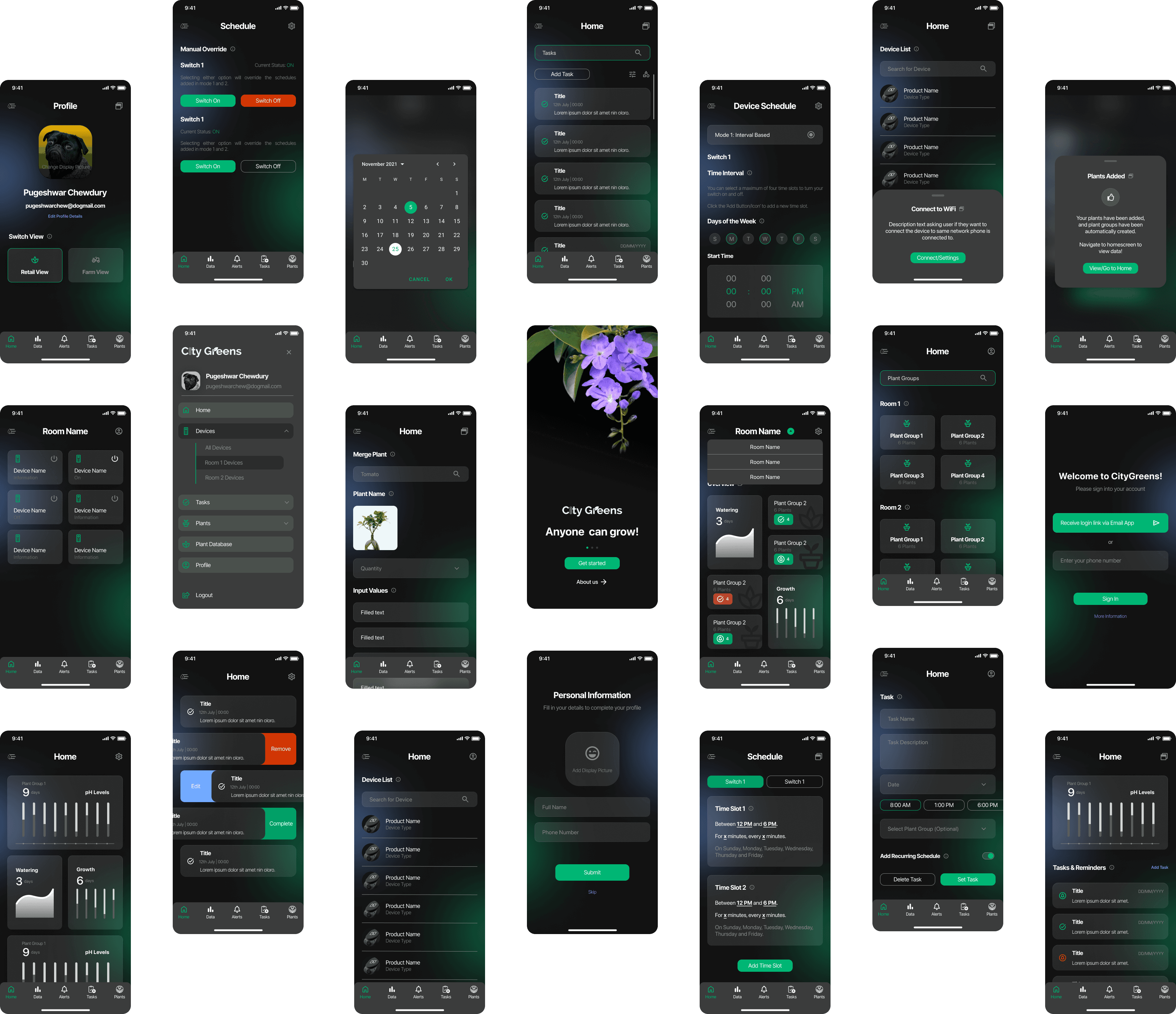
final designs
An app that allows for a seamless set-up, and simplifies communication between users.
Adding Devices
Establishing the integration of IoT devices with the application to effectively manage and visualise the various stages of plant growth
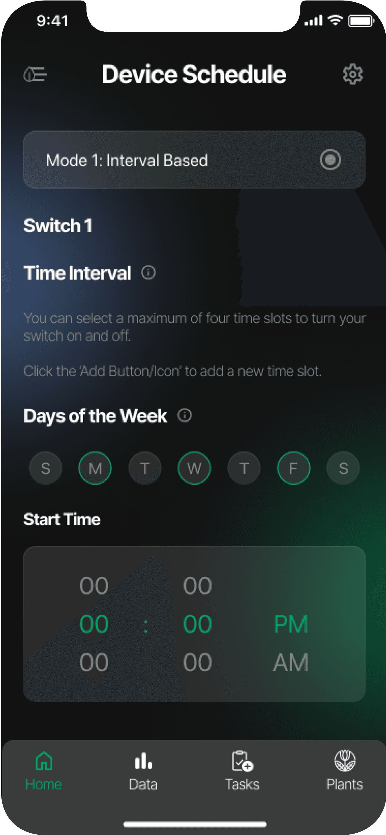


device schedules
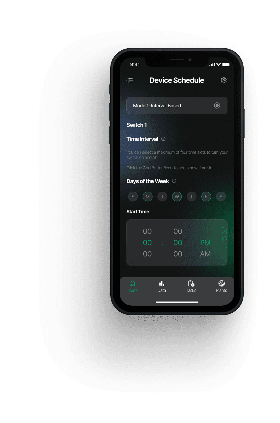
Users are able to effectively control their farm IoT devices from the app, setting schedules for each
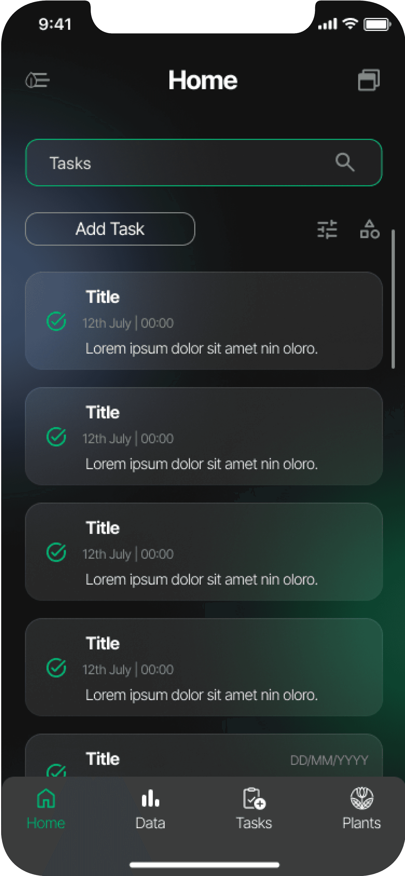
Adding tasks
Agronomists are able to set tasks for labourers to carry out

usability testing
Testing resulted in lesser drop-offs, with a significantly higher task completion rate
The farmers were able to fully visualise the crop plans which lead to better optimisation. Progress trackers helped cultivate the plants efficiently which also lead to lesser wastage.
learnings
Reflection
Designing for simplifying complex processes
It was tricky to keep appearances neutral while handling approachable messaging, along with simplifying flows for otherwise complex external device set up procedures. Since the app targeted parents, simplicity in task flows was enhanced to achieve seamless user experience. There is a lot I still have to learn about using the right language to be inclusive of everyone's identity.
Designing with the glass morphism style
I learned a lot about effective design practices for working with glass morphism elements. Using appropriate effects and colour palettes to achieve a visually appealing interface was the main challenge, after which the style was adopted throughout the app, along with texts, styles, and components.